

SUMMARY
This project serves as a tool for converting traditional flashcards into digital ones by creating a prototype for phones. Instead of static content, I transformed it into an interactive user experience on an electronic device. In short, this project represents the fusion of traditional design sensibility with modern interactive interfaces, demonstrating a commitment to innovation and user-centered design principles in the digital field.
GOALS
By leveraging graphic design principles, the aim of this project is to explore the evolution of design platforms towards the field of UI/UX interactive non-linear platforms. In addition, research on human behavioral psychology is also a focus that I aim to create an enjoyable and convenient experience for consumers. Target audience are young people who want to learn HTML and CSS.
FLASHCARD DESIGN
According to the results of my research, if relevant design shapes people's memory process by attracting attention, interaction, emotional connection and contextual cues related to information. Also use design elements like color contrast and interactivity to deepen encoding and maintain attention. In short, the more users are exposed to images and colors related to a certain field, the more effective their memorization will be. The topic of the flashcard is about terminology in the field of coding, specifically html and css. I want my design to make users think of code, the lines in a computer circuit as a way to illustrate the world of digital and electronics.
LO-FI WIREFRAME
I started by checking out flashcard apps like Quizlet or Duolingo. These 2 apps ensure usability, interaction and efficiency for users. I wanted the interface to be clean, intuitive and easy to navigate, minimizing clutter and distractions to ensure users could focus on learning without feeling overwhelmed. The “front” side will display the name of a term, followed by a definition on the “back” side. Because the definitions of the vocabulary words are quite long, I chose scrolling instead of flipping so that users can scroll down until they finish reading. Furthermore, there are navigation buttons so users can return to previous terms or choose to continue exploring.


MED-FI WIREFRAME AND DESIGN SYSTEM
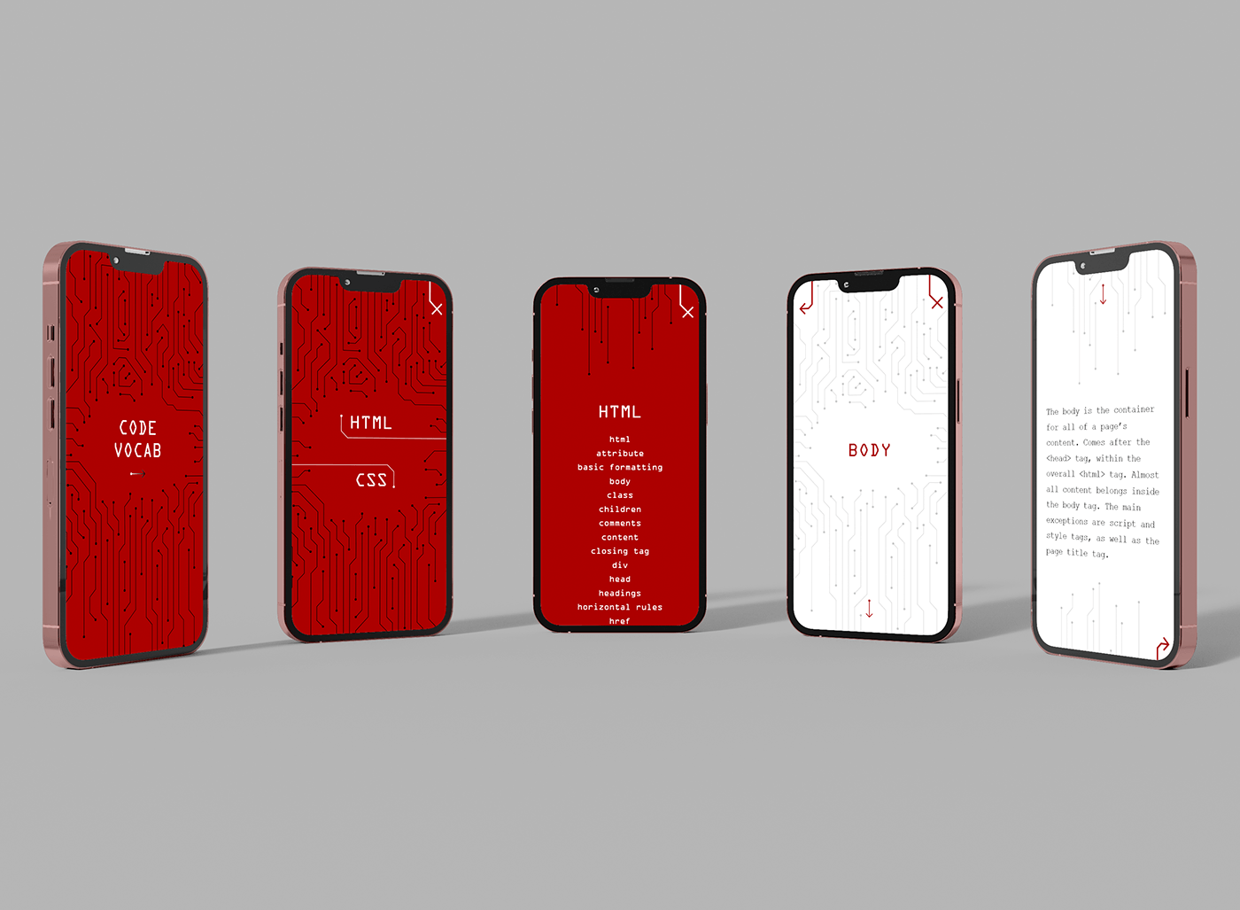
In this step, I choose the font and color of my flashcard. Since the definition is longer than 3 lines, a white background and dark text improves readability and legibility. Bold red letters stand out, attracting users' attention. ORC A font is monospaced font designed specifically for optical character recognition systems. Courier is also a monospaced serif font that is used in typewriter and computers. It's easy to read and has the aesthetic of antique typewriters, coding, and technical documents. Adding the microchip pattern, users can think of the digital world, they will feel like they are futuristic. I designed this app to fit my iPhone 11 pro max, I considered margins and padding and arranged the elements in a safe position, while ensuring my content is comfortably legible.


FINAL DESIGN
I also designed a cover page, HTML & CSS home page and a list of each word so that viewers can have an overall vocabulary view. On these pages, the background will be red, the pattern will be black so the white text can stand out but still keep the design consistent. Font size is also sized up so that users can read it.


NAVIGATION MAP
The navigation map of this app is quite simple. I want users to start with the cover page, they will have a choice of the learning section they want, be it HTML or CSS. Each slide will be divided into two directions, leading to lists of each language. The user can then choose to start at any vocabulary.

PROTOTYPE
On the first page, I made a loop animation for the arrow so the user can know how to manipulate and navigate. All pages have buttons to continue or return. Users can exit the vocabulary they are learning and continue on any other word, the order of words is arranged in Alphabetical order.

KNOWLEDGE GAINED
Through this project, I learned how to plan a navigation map, so that during implementation, everything is very quick but still perfect. I also learned to put myself in the role of a vocabulary learner so that I could create a good interactive flashcard experience. In particular, I also learned an animation effect in XD and it makes flashcards more interesting.


